As a character animation student, this semester has been a transformational learning journey for me. I have been trying to improve my professional skills. Through a lot of practice and reflection, I learned important lessons in three key areas: the importance of expressive lines in character sketches and frames, the acceptance of imperfection in stop-motion animation, and the power of abstraction in character design.
The movement of lines: tension and relaxation
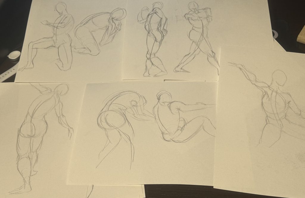
In life drawing, I learned that lines are not just simple outlines, they also contain vitality. At first, I drew stiff and rigid lines, flat figures, and lifeless poses. Vanessa taught us the bean shape theory to represent human body structure while Chris also told me to have loose lines in character animation. Bold, confident strokes can create dynamic arcs, while softer, more casual lines can show volume and movement. For example, drawing limbs with progressively thinner lines and varying the stroke force to reflect the weight can bring a static figure to life. This method is consistent with a principle in traditional animation, that is, the quality of the line can convey the strength of the action, which makes me have a deeper understanding of the “force” in the action.
Stop-motion animation: Imperfection and the illusion of life
Making stop-motion animation taught me to let go of perfectionism. Because there is no way to modify the actual shot, or restore the object that has changed its original position and shape completely. But I found that some minor flaws, like slightly misaligned figures or uneven lighting, were not noticeable in the final coherent picture. This is consistent with the principle of “visual persistence” and “motion blur” in animation, where the brain pays more attention to the flow of action than to the subtlety of a single image. For example, in the paper cut-out animation, the paper in background sometimes get moved accidentally, but at 25 frames per second, it looked natural because the audience was focused on the rhythm. This experience made me realize that animation’s vitality lies in “continuity”, not every frame is perfect.
Abstraction in character Design: Less is more

In the beginning, I made the characters too realistic with lots of details, and they were very difficult to animate. After studying Disney classics (like Mickey Mouse’s circular structure), I found that using simple geometric shapes made the characters more expressive. In lip sync projects, I designed a zebra as the protagonist in cartoon style. I gave up reproducing a real zebra but summarize its appearance with simple graphics. Then in animation stage, I found it easier to realize deformation and movement. Reduce facial details to a few symbolic lines so that even if the character moves quickly, the emotion is clearly conveyed. This echoes Eric Goldberg’s philosophy: “Simplicity is the backbone of personality.”
Leave a Reply